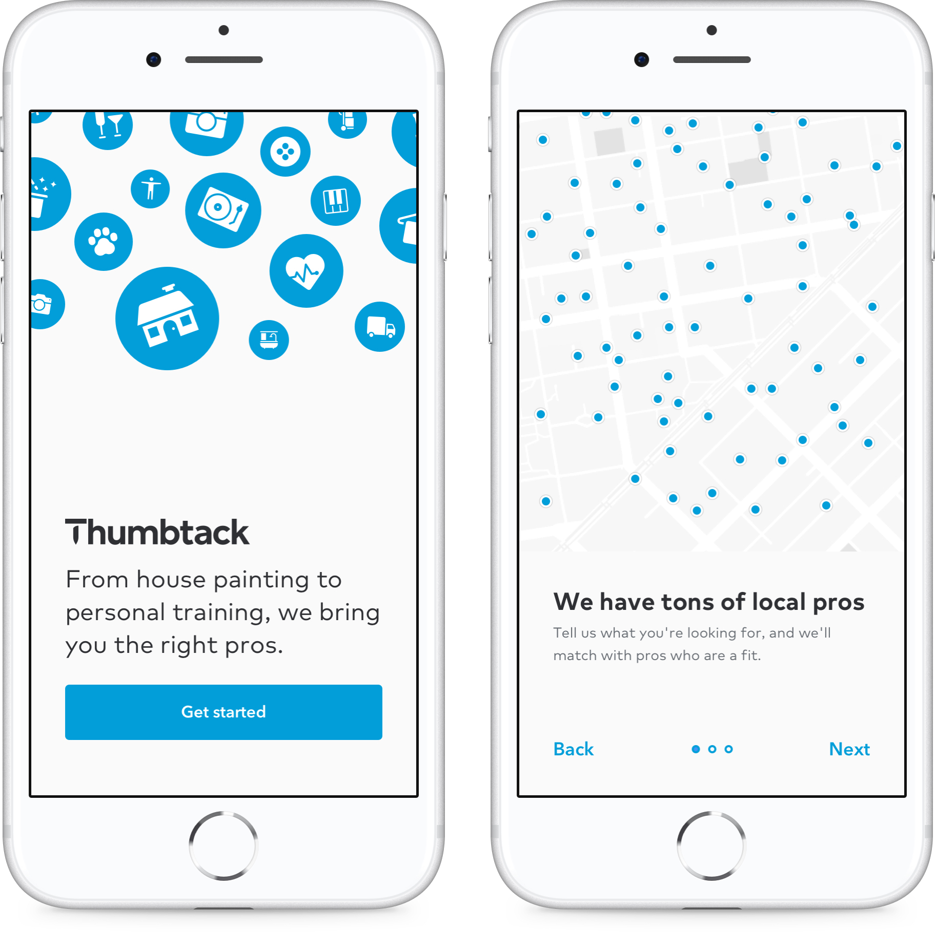
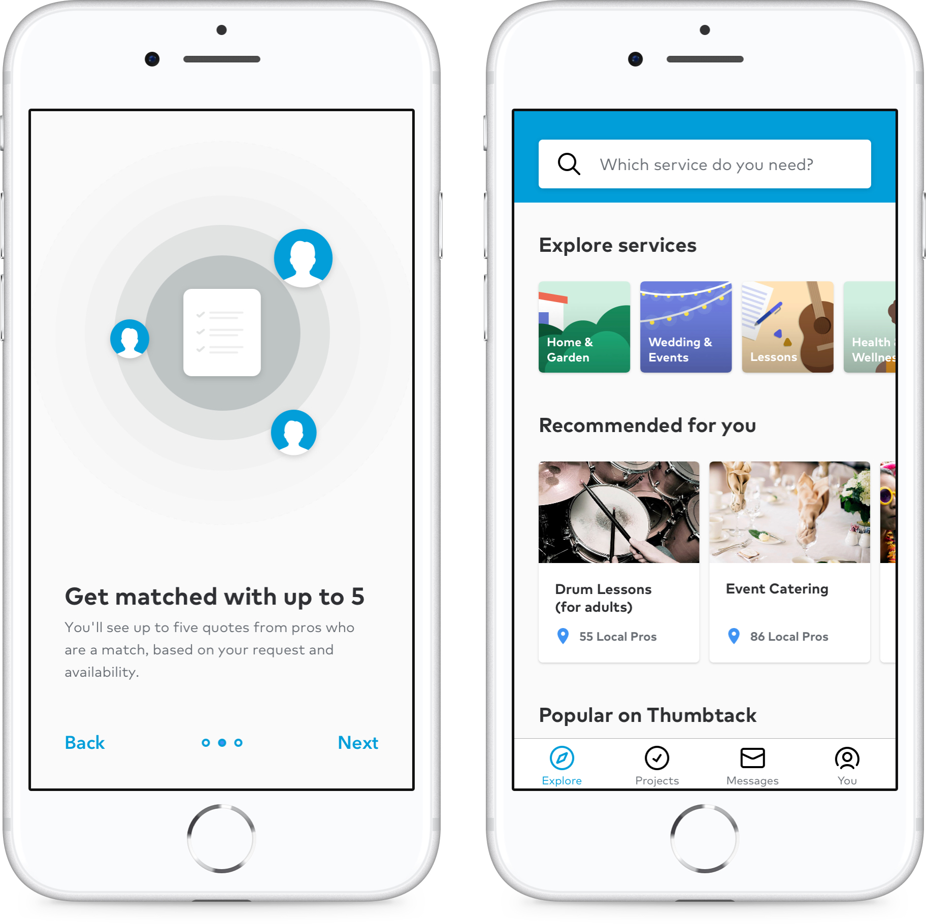
Mobile flow
I re-designed the most painful part of Thumbtack's native app experience, customer onboarding and user login capture.
Why?
The baseline flow would automatically create an account for users without requiring them to create a password. The approach to user authentication needed to be optimized and adequately aligned with the overarching vision of the product.
In parallel to enhancing the product usability, the visual styles also needed to be updated to reflect the current brand language.
How
1. Audit the current experience
2. Get user feedback
2. Look at outside examples
3. Find problems through user testing
4. Whiteboard, wireframe, & prototype
5. Begin work with engineers and iterate designs
6. Work on visual design and get more feedback
7. Dogfood internally, make final tweaks
8. Ship
Existing flow (Left to right) ↴
Logging into an app needs to be exciting and evoke trust. Most people using our app are completing tasks that are somewhat utilitarian and greatly effect their livelihood. I wanted to not only fix our problems, but delight users as they entered our app.
Goals
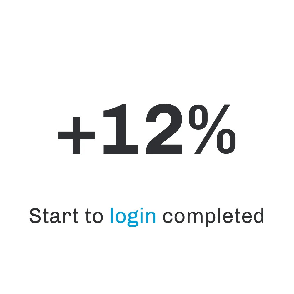
1. Increase the number of users logged in.
2. Increase user retention.
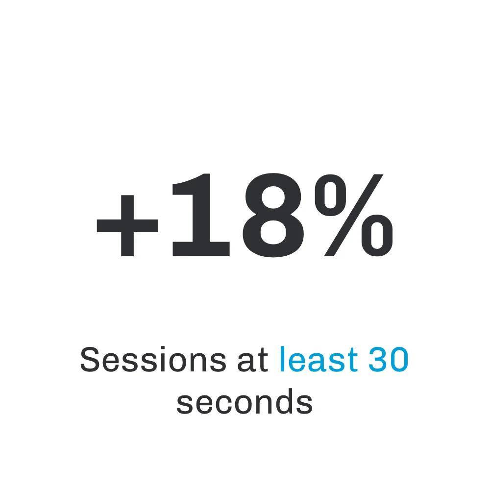
3. Increase engagement.
4. Increase the number of users with passwords.
5. Increase overall conversion.
Some early white boarding sessions with my PM ironing out the flow. ↴
Experiment A - “Aggressive" approach
In this flow, we were more aggressive by adding login right when you launch the app. The existing experience let users dive right into the product.
Experiment B - “Less Aggressive" approach
In this flow, the team wanted to be very intentional with creating a personal investment for the user in the product. We did this by adding a personalization feature prior to user login.


Results
Numbers don’t lie! I gained immense insight through the trackable key performance indicators which were established as the premise to drive our strategy.